
Pantone’s 2017 Color of the Year is Greenery, a revitalizing color you can incorporate into your home. Pantone describes it as a color that’s symbolic of new beginnings, which is perfect when remodeling your home. There are a number of ways to use Pantone’s Greenery throughout your home, whether you’d like to paint an entire wall or focus on small splashes of color.
Why Choose Pantone’s Color of the Year for Your Home?
Pantone is an organization that has developed a standard for color that’s used throughout design and manufacturing. Every year, they release their Color of the Year that shapes color trends in a number of industries. This year, they’ve created Greenery, and we’re excited about the potential it has for home painting.
“Greenery is a fresh and zesty yellow-green shade that evokes the first days of spring when nature’s greens revive, restore and renew. Illustrative of flourishing foliage and the lushness of the great outdoors, the fortifying attributes of Greenery signals consumers to take a deep breath, oxygenate and reinvigorate.” – Pantone Color Institute
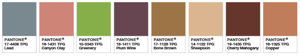
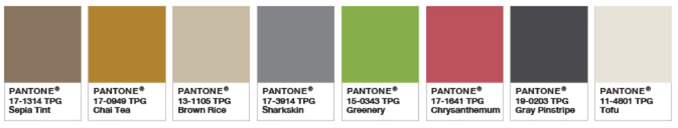
With a bright color like Greenery, it can be a fun challenge to create a cohesive space. But with each Color of the Year release, Pantone also shares some color palettes to provide some inspiration. We’re particularly interested in the Grand Canyon and Deep Rooted palettes.
Use the 60-30-10 Rule When Painting Your Home
When envisioning a space, it can be hard to find the right balance of color throughout the room, including the walls, furniture, and decor. If you’re wondering how people accomplish this, it’s due to the 60-30-10 rule. This rule focuses on the proportions of color within a space, so that no color is “fighting” against another to be the focal point.
- Your dominant color will be 60% of your space.
- Your secondary color will be 30% of your space.
- Your accent color will be 10% of your space
By following this rule, you can create a beautiful, balanced space. If you want to go bold, Greenery could be your dominant color. This could be your walls, and perhaps some accent pieces throughout.
If you would like to use Greenery, but aren’t sure about painting your walls a bright color like this, you can use it as a secondary color for 30% of your room. This could include furniture and curtains, though there are a number of options.
And if you love Greenery, but want to keep it as an accent, then choose 10% of your space to dedicate to the color. This could be dishes in glass cabinets in your kitchen, or a comfy chair in your living room with some small decor pieces on the mantle or kitchen. These decor pieces could include small bowls, candlesticks, or throw pillows.
When creating a space, using this rule can help you create a home you’ll love coming home to.
Using Pantone’s Greenery as an Accent Color
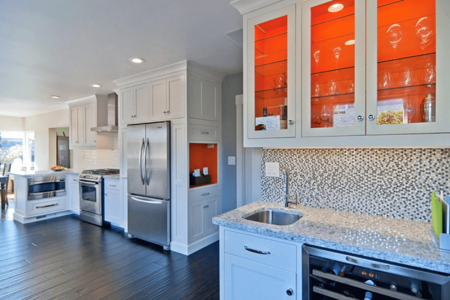
Accenting your home with a bright color such as Greenery gives your home an updated and unique look. White kitchens are a traditional favorite for many families, and gives a great foundation for some unique color choices.
Paint Accents for Your Kitchen
We love featuring bright colors in unique ways in your home. We can take a number of approaches to do this, and kitchens are ideal for this. In the kitchen pictured below, we painted the inside of each cabinet a bright orange.
Greenery is a fresh yet slightly more subtle shade than the orange pictured. This makes it ideal if you’d like more color in your home, but aren’t sure how to utilize it.
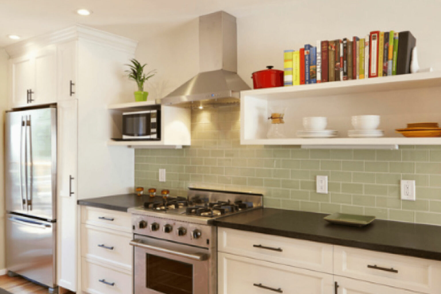
Backsplashes are also an ideal way to add an accent color to your kitchen. Shades of green can bring the outside into your home, and Pantone’s Greenery is the perfect choice. When used as a glass tile kitchen backsplash, you’re adding a bright, yet not overbearing color. Paired with green decor pieces like a fruit bowl, you can create a homey, welcoming kitchen.
Paint Accents for Your Bathroom
While we’ve talked a lot about using Greenery in the living spaces of your home, there are also ways to embrace this cheerful green in your bathroom. Think of it as a twist on the popular ocean or beach theme, but with forest inspiration. Using this, you can create a serene bathroom that can help you unwind at the end of the day.
In bathrooms, you could choose to incorporate this shade on one wall, or all of them. A space like your bathroom gives you a chance to use some unique colors in ways you may not want to use in the rest of your home.
External Paint Accents for Your Home
In following the 60-30-10 rule for your home’s exterior, your front door is a great space to use your 10% accent color. Red doors are a popular choice, and are a beautiful way to improve your home’s exterior. If you want to choose a less traditional color, Pantone’s Greenery is the perfect accent color for your home’s exterior.
In this home, we added a bright door to create a focal point. Using smaller areas is an ideal way to show your personality and add color without creating an overwhelming first impression. Your front door should be welcoming, which makes Pantone’s focus on new beginnings when choosing Greenery is the perfect fit.


